

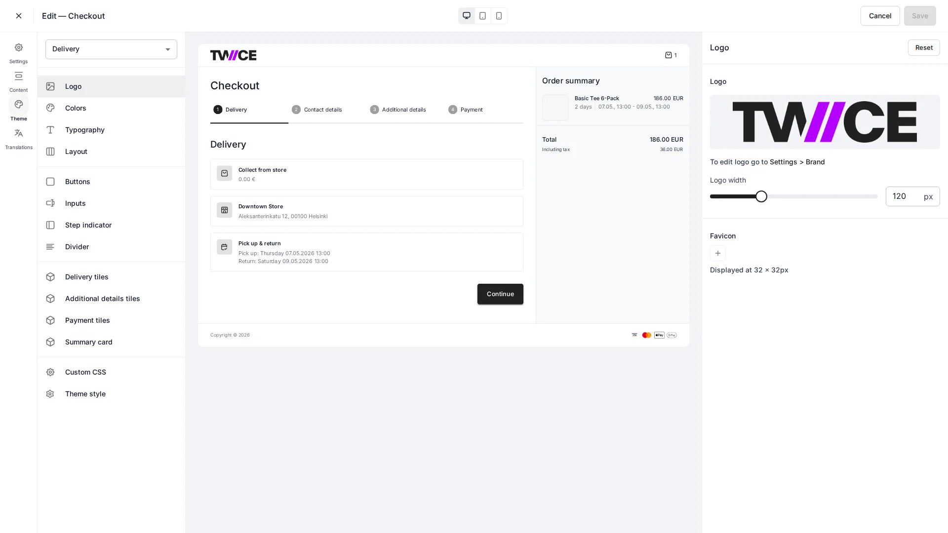
Settings > Checkouts > [Checkout] > Styling
Brand
Colors
Background, text, border, accent, and link colours, plus button background, text, and outline colours.Typography
Inputs and buttons
Layout
Page width and padding for the checkout container.Components
Style the building blocks of the checkout — dividers, the step indicator, payment tiles, delivery tiles, additional-details tiles, and the order summary card — each with its own background, text, border, radius, thickness, and padding.Custom CSS
Add custom CSS for anything the visual settings do not cover. As with the storefront, custom CSS is sanitised before it is saved.Related articles
Steps & sections
Configure the checkout flow and fields.
Theme Editor
Style the storefront itself.