

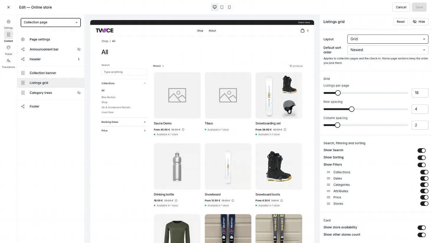
Theme Editor > Collection page > Listings grid

Theme Editor > Collection page
Sections
Two more groups sit inside the Listings grid panel. Search, filtering and sorting carries Show Search, Show Sorting and Show Filters. Card carries Show store availability, and Show other stores count under it.
Pick the sort the grid opens on
Set Default sort order under Layout in the Listings grid panel. The editor’s preview grid follows whatever you pick. A store that has never saved its storefront settings runs on Recommended. A store that saved them before 14 October 2026 keeps the Newest it was given then, until you change it here.
A shopper who picks their own sort overrides this, and their choice carries from one collection to the next.
The setting covers collection pages. Home page sections keep the order you give them there.
Choose which filters shoppers get
Turn Show Filters on and six switches appear below it, one per section of the filter sidebar. Turn off the ones your catalog does not need, and drag a section by its handle to change where it sits in the sidebar.
A section keeps its place in the list whether it is shown or not.
Collections, Categories, Attributes and Stores render only when there is something to offer. A collection whose listings carry no category shows no Categories section, however the switch is set.
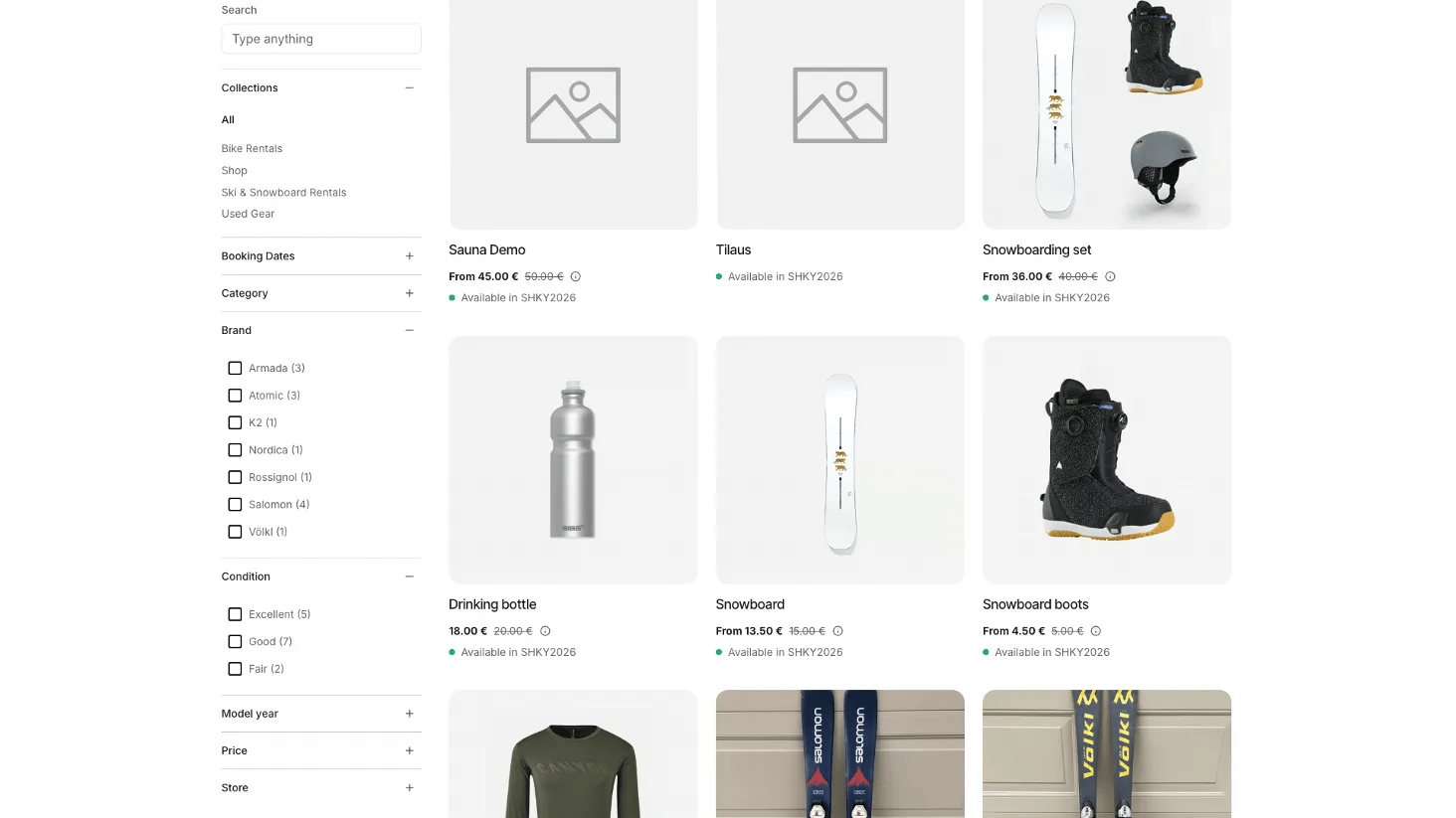
Online store > Collection page > Filter sidebar
What the Attributes section draws
Show as filter in online store, ticked on a listing attribute under Settings → Attributes & Tags, gives that attribute a section of its own here. Each value carries the number of listings behind it. A date attribute offers a date range instead of values. Counts follow the page and every other filter on it, so they say how many listings a shopper would be left with. Turn the section off and an attribute filter in the address bar narrows nothing. See Offer online store filters for the whole path from attribute to storefront. A store that saved its filter settings before 23 October 2026 starts with Attributes switched off. Turn it on to offer them. The sidebar is a fixed-width column, so it is left out rather than drawn empty: switch off Show Search and every filter, and the grid takes the full width. Show Sorting is unaffected, because sorting sits in the toolbar above the grid. Listing cards themselves are styled in the Listings card settings; the sidebar’s colours in Filter section.Shared blocks
The announcement bar, header, footer, and page settings apply across the store. See the blocks section of the Theme Editor overview.Related articles
Listings card
Style the listing cards in the grid.
Filter section
Style the filter sidebar.
Collections
How collections are built.
Category tree styles in the shop sidebar
The four ways the sidebar shows your category trees.
Offer online store filters
Mark a listing attribute as a filter and give your listings values.