> ## Documentation Index
> Fetch the complete documentation index at: https://www.twicecommerce.com/docs/llms.txt
> Use this file to discover all available pages before exploring further.
# Checkout - Styling
> Style the checkout — colours, typography, inputs, buttons, tiles, layout, logo, and custom CSS.
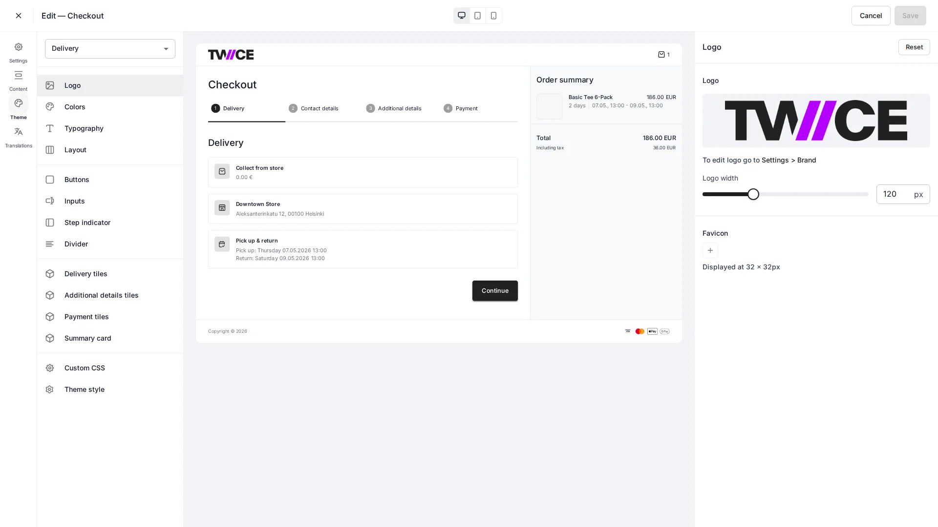 Each checkout has its own theme, separate from the storefront theme, so the checkout can match your brand independently. Styling is grouped into the sections below.
## Brand
| Setting | Description |
| ---------- | -------------------------------------- |
| Logo | The logo shown in the checkout header. |
| Logo width | Rendered width of the logo. |
## Colors
Background, text, border, accent, and link colours, plus button background, text, and outline colours.
## Typography
| Setting | Description |
| ------------ | --------------------------------------------------------------- |
| Heading font | Font family for headings, with a scale to size them up or down. |
| Body font | Font family for body text, with its own scale. |
## Inputs and buttons
| Group | Settings |
| ------- | ----------------------------------------------------------------------------- |
| Inputs | Background, text, label, and border colours; border thickness; corner radius. |
| Buttons | Corner radius and border thickness. (Colours are set under **Colors**.) |
## Layout
Page width and padding for the checkout container.
## Components
Style the building blocks of the checkout — dividers, the step indicator, payment tiles, delivery tiles, additional-details tiles, and the order summary card — each with its own background, text, border, radius, thickness, and padding.
## Custom CSS
Add custom CSS for anything the visual settings do not cover. As with the storefront, custom CSS is sanitised before it is saved.
## Related
Configure the checkout flow and fields.
Style the storefront itself.
Each checkout has its own theme, separate from the storefront theme, so the checkout can match your brand independently. Styling is grouped into the sections below.
## Brand
| Setting | Description |
| ---------- | -------------------------------------- |
| Logo | The logo shown in the checkout header. |
| Logo width | Rendered width of the logo. |
## Colors
Background, text, border, accent, and link colours, plus button background, text, and outline colours.
## Typography
| Setting | Description |
| ------------ | --------------------------------------------------------------- |
| Heading font | Font family for headings, with a scale to size them up or down. |
| Body font | Font family for body text, with its own scale. |
## Inputs and buttons
| Group | Settings |
| ------- | ----------------------------------------------------------------------------- |
| Inputs | Background, text, label, and border colours; border thickness; corner radius. |
| Buttons | Corner radius and border thickness. (Colours are set under **Colors**.) |
## Layout
Page width and padding for the checkout container.
## Components
Style the building blocks of the checkout — dividers, the step indicator, payment tiles, delivery tiles, additional-details tiles, and the order summary card — each with its own background, text, border, radius, thickness, and padding.
## Custom CSS
Add custom CSS for anything the visual settings do not cover. As with the storefront, custom CSS is sanitised before it is saved.
## Related
Configure the checkout flow and fields.
Style the storefront itself.