> ## Documentation Index
> Fetch the complete documentation index at: https://www.twicecommerce.com/docs/llms.txt
> Use this file to discover all available pages before exploring further.
# Checkout - Steps & Sections
> Configure the checkout flow: header, steps, fields, consents, payment, and confirmation.
 The checkout flow is built from a global header and footer, a step indicator, and a sequence of steps. Each step and section can be enabled, titled, and described. The steps run in this order:
**Contact → Delivery → Additional details → Payment → Confirmation.**
## Header and footer
| Section | Settings |
| -------------- | ------------------------------------------------------------------------------------------------------------------------------------------------- |
| Header | Logo position (left or center) and sticky behaviour (off, on scroll up, always, or always with a reduced logo). |
| Step indicator | Enable it and choose a variant — **bar**, **numbered**, or **minimal**. Toggle step labels and step numbers, and override the label for any step. |
| Footer | Show payment icons and policy links, and choose which policy documents appear. |
| Submit button | Set the button labels (submit, continue, back). |
## Checkout title
Optionally show a title and description at the top of the checkout. Each is independently toggleable with its own text.
## Contact
The Contact step collects customer details through a **dynamic form** you assemble.
Add and order form items:
* **Standard fields** — first name, last name, email, phone. Set each required or optional and override its label.
* **Customer profile fields** — built-in fields that already exist on the [customer profile](/docs/concepts/customers/customer-profiles), such as date of birth, billing address, and tax ID. Values save to the customer record. See below.
* **Custom fields** — text, select, number, or checkbox inputs you define. Each custom field can be marked required and given a custom label.
* **Attributes** — bind a field to an [attribute](/docs/concepts/admin/attributes). If the attribute's resource is **Customers**, the value saves to the customer profile. If the resource is **Orders**, the value saves to the order and appears in the confirmation email.
Use the **same row as previous** option to place two fields side by side.
### Customer profile fields
The checkout flow is built from a global header and footer, a step indicator, and a sequence of steps. Each step and section can be enabled, titled, and described. The steps run in this order:
**Contact → Delivery → Additional details → Payment → Confirmation.**
## Header and footer
| Section | Settings |
| -------------- | ------------------------------------------------------------------------------------------------------------------------------------------------- |
| Header | Logo position (left or center) and sticky behaviour (off, on scroll up, always, or always with a reduced logo). |
| Step indicator | Enable it and choose a variant — **bar**, **numbered**, or **minimal**. Toggle step labels and step numbers, and override the label for any step. |
| Footer | Show payment icons and policy links, and choose which policy documents appear. |
| Submit button | Set the button labels (submit, continue, back). |
## Checkout title
Optionally show a title and description at the top of the checkout. Each is independently toggleable with its own text.
## Contact
The Contact step collects customer details through a **dynamic form** you assemble.
Add and order form items:
* **Standard fields** — first name, last name, email, phone. Set each required or optional and override its label.
* **Customer profile fields** — built-in fields that already exist on the [customer profile](/docs/concepts/customers/customer-profiles), such as date of birth, billing address, and tax ID. Values save to the customer record. See below.
* **Custom fields** — text, select, number, or checkbox inputs you define. Each custom field can be marked required and given a custom label.
* **Attributes** — bind a field to an [attribute](/docs/concepts/admin/attributes). If the attribute's resource is **Customers**, the value saves to the customer profile. If the resource is **Orders**, the value saves to the order and appears in the confirmation email.
Use the **same row as previous** option to place two fields side by side.
### Customer profile fields
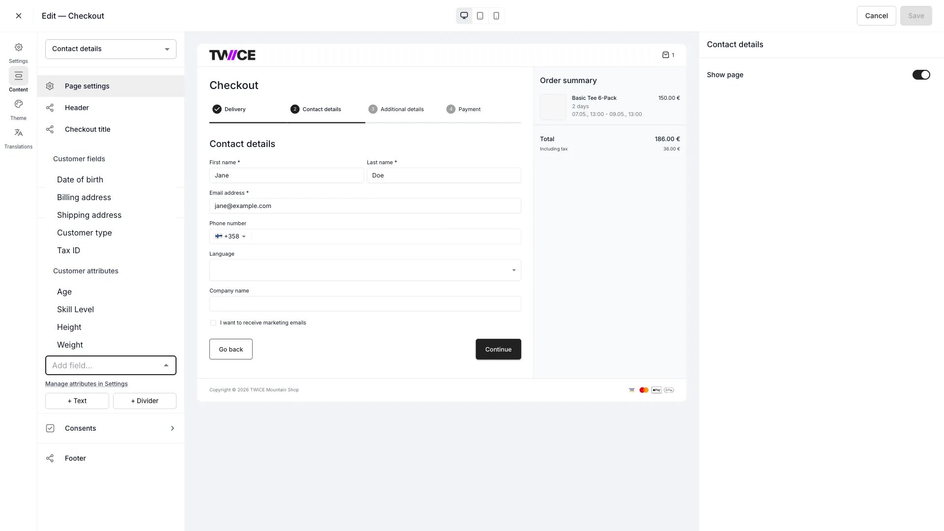 Fields already placed on the form leave the picker — in the screenshot, Language and Company name are missing from the list because they are already on the Contact step.
Seven built-in fields from the [customer profile](/docs/concepts/customers/customer-profiles) can be collected at checkout. In the **Add field** picker they sit under **Customer fields**, next to the standard fields. Each value writes to the matching column on the customer record when the order is placed — these are profile fields, not [attributes](/docs/concepts/admin/attributes).
| Field | Renders as |
| :--------------- | :-------------------------------------------------- |
| Date of birth | Date input |
| Billing address | Grouped address lines |
| Shipping address | Grouped address lines |
| Language | Dropdown of the languages TWICE storefronts support |
| Customer type | Dropdown — Individual or Business |
| Company name | Text input |
| Tax ID | Text input |
Each field can be added once per checkout. Per field you set:
* **Required** — the customer must fill it before continuing past the Contact step.
* **Label** — replaces the default label above the field. Leave it empty to keep the default.
* **Placeholder** — placeholder text inside the input.
* **Same row as previous field** — place it beside the preceding field.
**Billing address** and **shipping address** render as a group of labelled lines rather than one input: **Street address**, then **ZIP / Postal code** and **City** side by side, then **Country**. The field's label — yours or the default — sits above the group as a bold heading.
Fields already placed on the form leave the picker — in the screenshot, Language and Company name are missing from the list because they are already on the Contact step.
Seven built-in fields from the [customer profile](/docs/concepts/customers/customer-profiles) can be collected at checkout. In the **Add field** picker they sit under **Customer fields**, next to the standard fields. Each value writes to the matching column on the customer record when the order is placed — these are profile fields, not [attributes](/docs/concepts/admin/attributes).
| Field | Renders as |
| :--------------- | :-------------------------------------------------- |
| Date of birth | Date input |
| Billing address | Grouped address lines |
| Shipping address | Grouped address lines |
| Language | Dropdown of the languages TWICE storefronts support |
| Customer type | Dropdown — Individual or Business |
| Company name | Text input |
| Tax ID | Text input |
Each field can be added once per checkout. Per field you set:
* **Required** — the customer must fill it before continuing past the Contact step.
* **Label** — replaces the default label above the field. Leave it empty to keep the default.
* **Placeholder** — placeholder text inside the input.
* **Same row as previous field** — place it beside the preceding field.
**Billing address** and **shipping address** render as a group of labelled lines rather than one input: **Street address**, then **ZIP / Postal code** and **City** side by side, then **Country**. The field's label — yours or the default — sits above the group as a bold heading.
 The street line stands in for the whole address in configuration and validation. Your placeholder, the required marker, and the inline error all attach to it, so marking an address required means the customer must fill **Street address** — the ZIP, city, and country lines stay optional.
### Select (dropdown) fields
The street line stands in for the whole address in configuration and validation. Your placeholder, the required marker, and the inline error all attach to it, so marking an address required means the customer must fill **Street address** — the ZIP, city, and country lines stay optional.
### Select (dropdown) fields
 A **select** custom field renders as a dropdown at checkout. To configure one:
1. Add a custom field and set its type to **Select**.
2. Add at least one option. Each option has a name that is both the label customers see and the value stored on the order.
3. Option names must be unique (compared after trimming whitespace). Empty names are ignored.
At checkout, the dropdown includes a blank choice so customers can clear their selection if the field is not required.
The stored value is the option's name string. If you rename or remove an option after orders have been placed, existing orders keep the original value. The old value still appears on those orders in the admin.
Add consent checkboxes:
* **Marketing consent** — a system consent that saves to the customer's marketing attribute.
* **Custom consents** — your own consent text with a link to a policy document or an external URL.
Each consent can be marked required and given prefix and suffix text around the link.
## Delivery
Choose which fulfillment options the customer can pick: **pickup**, **shipping**, and **delivery**. Override the label for each, set the pickup method and pickup location, and configure the date and time schedule customers select from.
## Additional details
An optional step for extra information — for example a gift message or order reference. Toggle it on and set its title and description.
## Payment
Select which payment methods appear: **system methods** (your connected providers) and any **custom methods** you have defined. Override method labels, and set the step's title and description.
Manage the providers themselves under [Payments settings](/docs/settings/payments). The Payment step controls which of your configured methods are offered in this checkout.
## Order summary
Control the order review shown alongside the steps: toggle item images and the summary title.
## Confirmation
The post-purchase screen is a **builder** of display items you can reorder and toggle:
* Information items — order number, order date, contact info, billing address, delivery details
* Layout items — a heading, a text block, and a continue button (with an internal or external link)
Each item can be enabled and relabelled.
## Related
Colours, typography, inputs, and layout.
Connect and manage payment providers.
A **select** custom field renders as a dropdown at checkout. To configure one:
1. Add a custom field and set its type to **Select**.
2. Add at least one option. Each option has a name that is both the label customers see and the value stored on the order.
3. Option names must be unique (compared after trimming whitespace). Empty names are ignored.
At checkout, the dropdown includes a blank choice so customers can clear their selection if the field is not required.
The stored value is the option's name string. If you rename or remove an option after orders have been placed, existing orders keep the original value. The old value still appears on those orders in the admin.
Add consent checkboxes:
* **Marketing consent** — a system consent that saves to the customer's marketing attribute.
* **Custom consents** — your own consent text with a link to a policy document or an external URL.
Each consent can be marked required and given prefix and suffix text around the link.
## Delivery
Choose which fulfillment options the customer can pick: **pickup**, **shipping**, and **delivery**. Override the label for each, set the pickup method and pickup location, and configure the date and time schedule customers select from.
## Additional details
An optional step for extra information — for example a gift message or order reference. Toggle it on and set its title and description.
## Payment
Select which payment methods appear: **system methods** (your connected providers) and any **custom methods** you have defined. Override method labels, and set the step's title and description.
Manage the providers themselves under [Payments settings](/docs/settings/payments). The Payment step controls which of your configured methods are offered in this checkout.
## Order summary
Control the order review shown alongside the steps: toggle item images and the summary title.
## Confirmation
The post-purchase screen is a **builder** of display items you can reorder and toggle:
* Information items — order number, order date, contact info, billing address, delivery details
* Layout items — a heading, a text block, and a continue button (with an internal or external link)
Each item can be enabled and relabelled.
## Related
Colours, typography, inputs, and layout.
Connect and manage payment providers.