> ## Documentation Index
> Fetch the complete documentation index at: https://www.twicecommerce.com/docs/llms.txt
> Use this file to discover all available pages before exploring further.
# Theme Editor - Listings card
> Configure how listing cards appear in collection grids — colours, borders, spacing, alignment, and image settings.
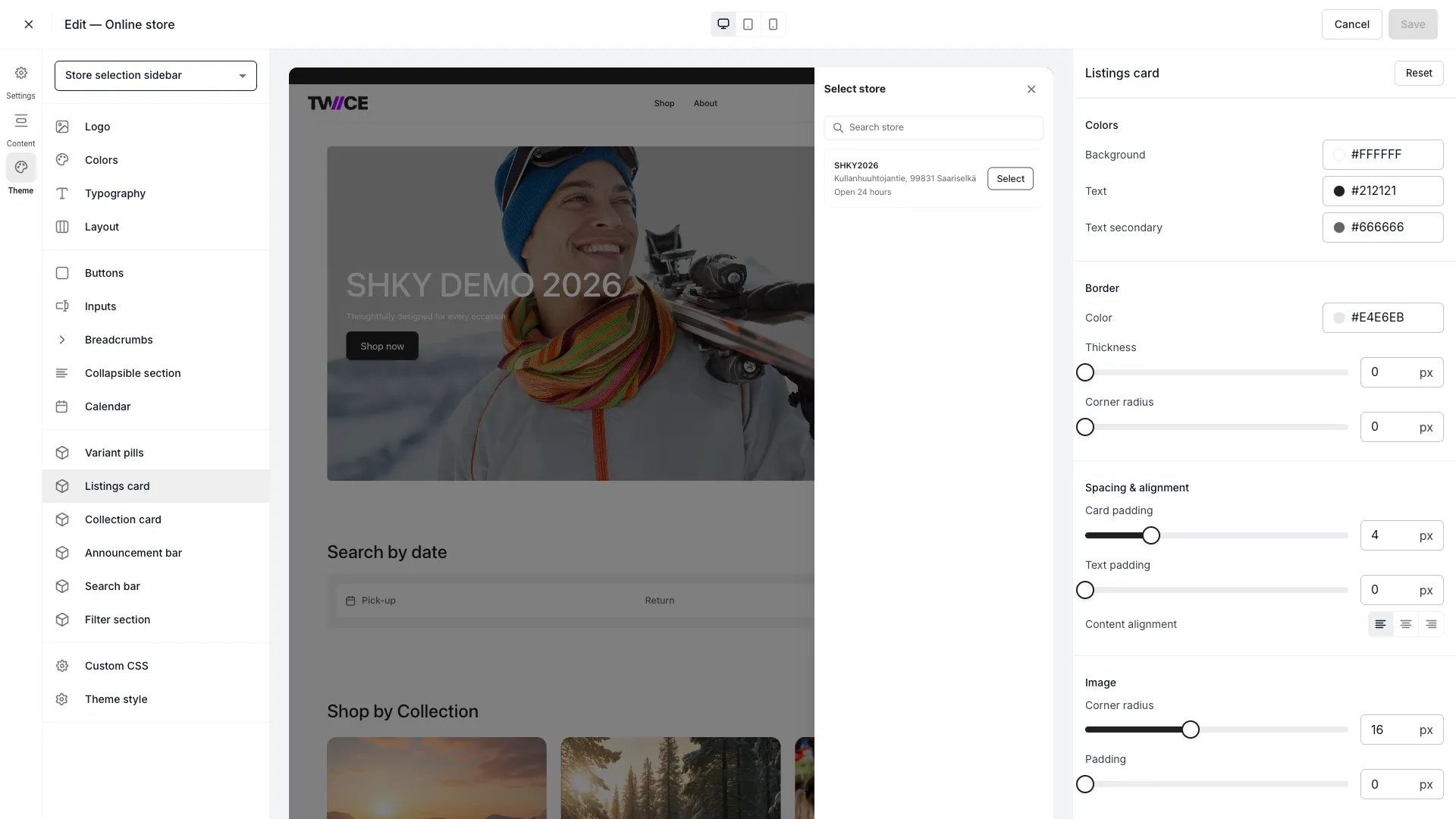 The Listings card panel controls how product cards appear in collection grids and listing rows. These cards are the primary way customers browse your catalogue, so styling them well directly affects the shopping experience.
## Colors
| Setting | Default | Description |
| -------------- | --------- | --------------------------------------------- |
| Background | `#FFFFFF` | Card background fill. |
| Text | `#111826` | Primary text colour — product name and price. |
| Text secondary | `#374152` | Supporting text — descriptions and metadata. |
## Border
| Setting | Type | Default | Range | Description |
| ------------- | ------ | --------- | ------- | ----------------------------------------------- |
| Color | Color | `#E4E6EB` | — | Border colour around the card. |
| Thickness | Slider | 0 px | 0–8 px | Border width. Default is 0 (no visible border). |
| Corner radius | Slider | 0 px | 0–40 px | How rounded the card corners are. |
## Spacing and alignment
| Setting | Type | Default | Range | Description |
| ----------------- | ------ | ------- | --------------------- | ---------------------------------------------------------------------- |
| Card padding | Slider | 0 px | 0–16 px | Space between the card border and its content. |
| Text padding | Slider | 0 px | 0–16 px | Space between the image area and the text content below it. |
| Content alignment | Toggle | Left | Left / Center / Right | Horizontal alignment of the product name, price, and description text. |
## Image
| Setting | Type | Default | Range | Description |
| ------------- | ------ | ------- | ------- | ---------------------------------------------------- |
| Corner radius | Slider | 4 px | 0–40 px | How rounded the product image corners are. |
| Padding | Slider | 0 px | 0–16 px | Space between the card border and the product image. |
## CSS variables
```css CSS variables theme={null}
:root {
--storefront-listings-card-background: #FFFFFF;
--storefront-listings-card-text-color: #111826;
--storefront-listings-card-text-secondary-color: #374152;
--storefront-listings-card-border-color: #E4E6EB;
--storefront-listings-card-border-width: 0px;
--storefront-listings-card-border-radius: 0px;
--storefront-listings-card-padding: 0px;
--storefront-listings-card-content-padding: 0px;
--storefront-listings-card-content-alignment: left;
--storefront-listings-card-image-border-radius: 4px;
--storefront-listings-card-image-padding: 0px;
}
```
## Related
Define the storefront colour palette.
Control page width and spacing.
The Listings card panel controls how product cards appear in collection grids and listing rows. These cards are the primary way customers browse your catalogue, so styling them well directly affects the shopping experience.
## Colors
| Setting | Default | Description |
| -------------- | --------- | --------------------------------------------- |
| Background | `#FFFFFF` | Card background fill. |
| Text | `#111826` | Primary text colour — product name and price. |
| Text secondary | `#374152` | Supporting text — descriptions and metadata. |
## Border
| Setting | Type | Default | Range | Description |
| ------------- | ------ | --------- | ------- | ----------------------------------------------- |
| Color | Color | `#E4E6EB` | — | Border colour around the card. |
| Thickness | Slider | 0 px | 0–8 px | Border width. Default is 0 (no visible border). |
| Corner radius | Slider | 0 px | 0–40 px | How rounded the card corners are. |
## Spacing and alignment
| Setting | Type | Default | Range | Description |
| ----------------- | ------ | ------- | --------------------- | ---------------------------------------------------------------------- |
| Card padding | Slider | 0 px | 0–16 px | Space between the card border and its content. |
| Text padding | Slider | 0 px | 0–16 px | Space between the image area and the text content below it. |
| Content alignment | Toggle | Left | Left / Center / Right | Horizontal alignment of the product name, price, and description text. |
## Image
| Setting | Type | Default | Range | Description |
| ------------- | ------ | ------- | ------- | ---------------------------------------------------- |
| Corner radius | Slider | 4 px | 0–40 px | How rounded the product image corners are. |
| Padding | Slider | 0 px | 0–16 px | Space between the card border and the product image. |
## CSS variables
```css CSS variables theme={null}
:root {
--storefront-listings-card-background: #FFFFFF;
--storefront-listings-card-text-color: #111826;
--storefront-listings-card-text-secondary-color: #374152;
--storefront-listings-card-border-color: #E4E6EB;
--storefront-listings-card-border-width: 0px;
--storefront-listings-card-border-radius: 0px;
--storefront-listings-card-padding: 0px;
--storefront-listings-card-content-padding: 0px;
--storefront-listings-card-content-alignment: left;
--storefront-listings-card-image-border-radius: 4px;
--storefront-listings-card-image-padding: 0px;
}
```
## Related
Define the storefront colour palette.
Control page width and spacing.