> ## Documentation Index
> Fetch the complete documentation index at: https://www.twicecommerce.com/docs/llms.txt
> Use this file to discover all available pages before exploring further.
# Theme Editor - Inputs
> Configure input field colours, border thickness, and corner radius for forms across the storefront.
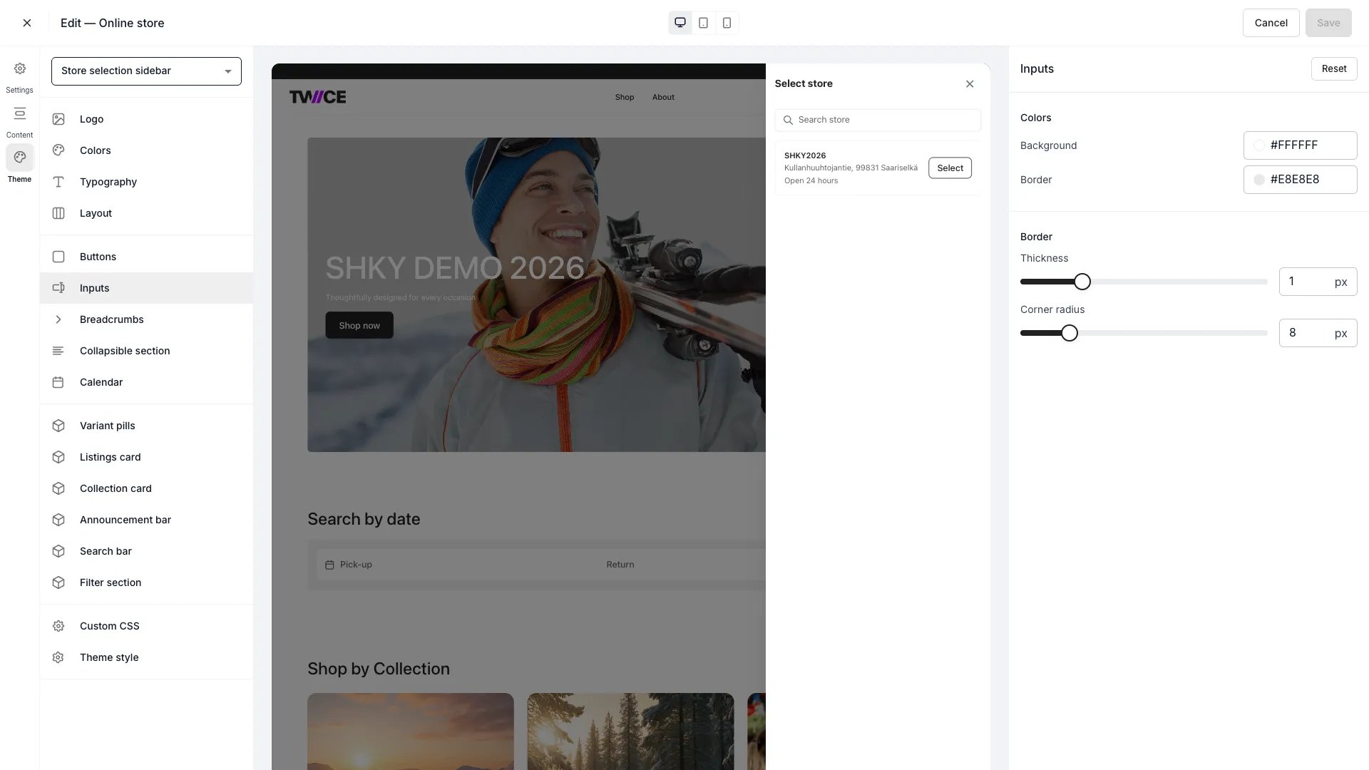 The Inputs panel controls the appearance of text fields, dropdowns, and other form controls on your storefront — checkout forms, search bars, and quantity selectors all inherit these styles.
## Colors
| Setting | Default | Description |
| ---------- | --------- | --------------------------------------------------------- |
| Background | `#FFFFFF` | Fill colour of input fields. |
| Border | `#E4E6EB` | Border colour around input fields in their default state. |
## Border
| Setting | Type | Default | Range | Description |
| ------------- | ------ | ------- | ------- | ----------------------------------------------------------------- |
| Thickness | Slider | 1 px | 0–4 px | Border width around input fields. Set to 0 for borderless inputs. |
| Corner radius | Slider | 6 px | 0–40 px | How rounded the input corners are. 0 gives sharp corners. |
## CSS variables
```css CSS variables theme={null}
:root {
--storefront-input-background-color: #FFFFFF;
--storefront-input-border-color: #E4E6EB;
--storefront-input-border-width: 1px;
--storefront-input-border-radius: 6px;
}
```
## Related
Configure button styles.
Customise the rental date picker.
The Inputs panel controls the appearance of text fields, dropdowns, and other form controls on your storefront — checkout forms, search bars, and quantity selectors all inherit these styles.
## Colors
| Setting | Default | Description |
| ---------- | --------- | --------------------------------------------------------- |
| Background | `#FFFFFF` | Fill colour of input fields. |
| Border | `#E4E6EB` | Border colour around input fields in their default state. |
## Border
| Setting | Type | Default | Range | Description |
| ------------- | ------ | ------- | ------- | ----------------------------------------------------------------- |
| Thickness | Slider | 1 px | 0–4 px | Border width around input fields. Set to 0 for borderless inputs. |
| Corner radius | Slider | 6 px | 0–40 px | How rounded the input corners are. 0 gives sharp corners. |
## CSS variables
```css CSS variables theme={null}
:root {
--storefront-input-background-color: #FFFFFF;
--storefront-input-border-color: #E4E6EB;
--storefront-input-border-width: 1px;
--storefront-input-border-radius: 6px;
}
```
## Related
Configure button styles.
Customise the rental date picker.