> ## Documentation Index
> Fetch the complete documentation index at: https://www.twicecommerce.com/docs/llms.txt
> Use this file to discover all available pages before exploring further.
# Theme Editor - Colors
> Define the colour palette used across the storefront — background, text, border, control, and status colours.
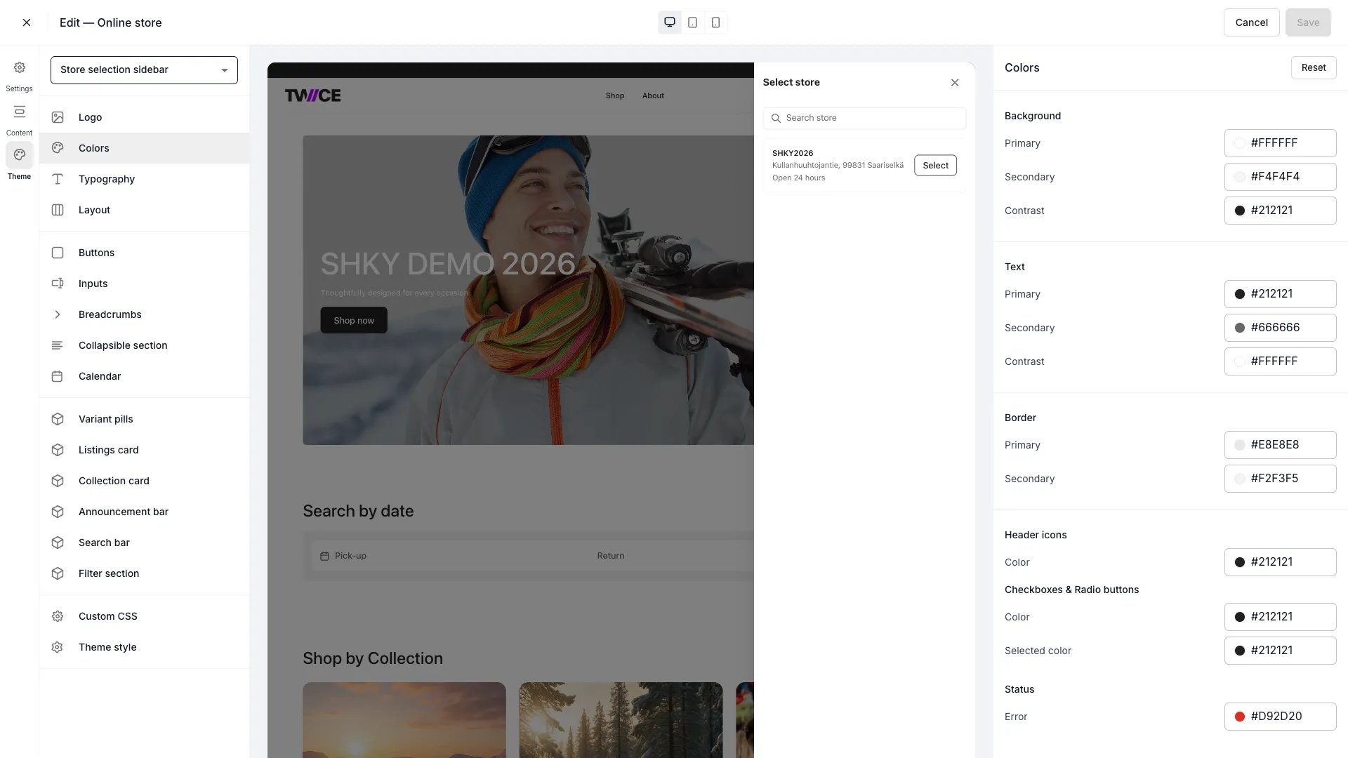 The Colors panel defines the colour palette applied across every page of your storefront. Changes propagate globally — updating a colour here updates every element that references it.
Each colour accepts a hex value (e.g. `#111826`). Click the swatch to open the colour picker, or type a hex code directly.
## Background
| Setting | Default | Description |
| --------- | --------- | -------------------------------------------------------- |
| Primary | `#FFFFFF` | Main page background. |
| Secondary | `#F7F9FA` | Alternate surface areas such as cards and side panels. |
| Contrast | `#111826` | High-contrast surfaces like the header or dark sections. |
## Text
| Setting | Default | Description |
| --------- | --------- | ------------------------------------------ |
| Primary | `#111826` | Headings and primary body text. |
| Secondary | `#374152` | Supporting text, labels, and descriptions. |
| Contrast | `#FFFFFF` | Text on contrast-coloured backgrounds. |
## Border
| Setting | Default | Description |
| --------- | --------- | ----------------------------------------------- |
| Primary | `#E4E6EB` | Dividers, card borders, and section separators. |
| Secondary | `#F2F3F5` | Subtle separators and secondary dividers. |
## Checkboxes and radio buttons
| Setting | Default | Description |
| -------------- | --------- | ------------------------------------------------------------- |
| Color | `#374152` | Default (unselected) colour for checkboxes and radio buttons. |
| Selected color | `#111826` | Colour when a checkbox or radio button is selected. |
## Status
| Setting | Default | Description |
| ------- | --------- | ------------------------------------------------------------------- |
| Error | `#D92D20` | Validation errors, out-of-stock indicators, and other error states. |
## CSS variables
Every colour maps to a CSS variable you can reference in [Custom CSS](/docs/sales-channels/online-store/theme-editor/settings/custom-css):
```css CSS variables theme={null}
:root {
--storefront-color-background: #FFFFFF;
--storefront-color-background-secondary: #F7F9FA;
--storefront-color-background-contrast: #111826;
--storefront-color-text: #111826;
--storefront-color-text-secondary: #374152;
--storefront-color-text-contrast: #FFFFFF;
--storefront-color-border: #E4E6EB;
--storefront-color-border-secondary: #F2F3F5;
--storefront-selection-control-color: #374152;
--storefront-selection-control-selected-color: #111826;
--storefront-color-error: #D92D20;
}
```
## Related
Customize header background, text, icon, and border colours.
Configure font families and sizing.
Override any style with custom CSS.
The Colors panel defines the colour palette applied across every page of your storefront. Changes propagate globally — updating a colour here updates every element that references it.
Each colour accepts a hex value (e.g. `#111826`). Click the swatch to open the colour picker, or type a hex code directly.
## Background
| Setting | Default | Description |
| --------- | --------- | -------------------------------------------------------- |
| Primary | `#FFFFFF` | Main page background. |
| Secondary | `#F7F9FA` | Alternate surface areas such as cards and side panels. |
| Contrast | `#111826` | High-contrast surfaces like the header or dark sections. |
## Text
| Setting | Default | Description |
| --------- | --------- | ------------------------------------------ |
| Primary | `#111826` | Headings and primary body text. |
| Secondary | `#374152` | Supporting text, labels, and descriptions. |
| Contrast | `#FFFFFF` | Text on contrast-coloured backgrounds. |
## Border
| Setting | Default | Description |
| --------- | --------- | ----------------------------------------------- |
| Primary | `#E4E6EB` | Dividers, card borders, and section separators. |
| Secondary | `#F2F3F5` | Subtle separators and secondary dividers. |
## Checkboxes and radio buttons
| Setting | Default | Description |
| -------------- | --------- | ------------------------------------------------------------- |
| Color | `#374152` | Default (unselected) colour for checkboxes and radio buttons. |
| Selected color | `#111826` | Colour when a checkbox or radio button is selected. |
## Status
| Setting | Default | Description |
| ------- | --------- | ------------------------------------------------------------------- |
| Error | `#D92D20` | Validation errors, out-of-stock indicators, and other error states. |
## CSS variables
Every colour maps to a CSS variable you can reference in [Custom CSS](/docs/sales-channels/online-store/theme-editor/settings/custom-css):
```css CSS variables theme={null}
:root {
--storefront-color-background: #FFFFFF;
--storefront-color-background-secondary: #F7F9FA;
--storefront-color-background-contrast: #111826;
--storefront-color-text: #111826;
--storefront-color-text-secondary: #374152;
--storefront-color-text-contrast: #FFFFFF;
--storefront-color-border: #E4E6EB;
--storefront-color-border-secondary: #F2F3F5;
--storefront-selection-control-color: #374152;
--storefront-selection-control-selected-color: #111826;
--storefront-color-error: #D92D20;
}
```
## Related
Customize header background, text, icon, and border colours.
Configure font families and sizing.
Override any style with custom CSS.