> ## Documentation Index
> Fetch the complete documentation index at: https://www.twicecommerce.com/docs/llms.txt
> Use this file to discover all available pages before exploring further.
# Theme Editor - Collection card
> Style the cards that represent collections in storefront grids and lists.
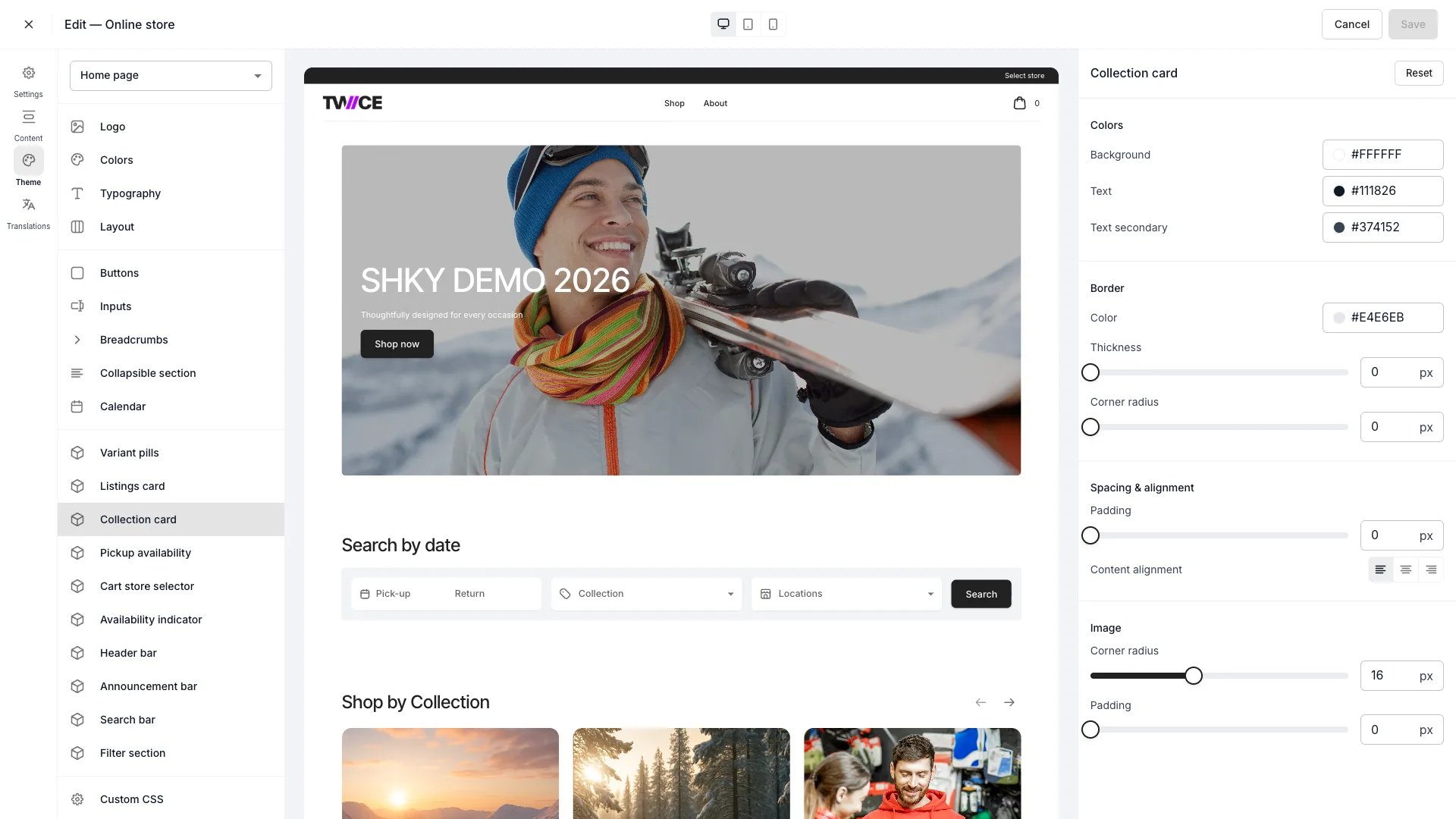 The Collection card panel controls how [collection](/docs/concepts/catalog/collections) cards appear — for example in the collection list on the home page. It is separate from the [Listings card](/docs/sales-channels/online-store/theme-editor/settings/listings-card) panel, which styles product cards. Found under **Cards** in the theme editor.
## Colors
| Setting | Default | Description |
| -------------- | --------- | ------------------------------ |
| Background | `#FFFFFF` | Card background fill. |
| Border | `#E4E6EB` | Border colour around the card. |
| Text | `#111826` | Title text colour. |
| Text secondary | `#374152` | Description text colour. |
## Border and spacing
| Setting | Type | Default | Range | Description |
| ----------------- | ------ | ------- | --------------------- | ----------------------------------------------- |
| Border thickness | Slider | 0 px | 0–8 px | Border width. Default is 0 (no visible border). |
| Corner radius | Slider | 0 px | 0–40 px | How rounded the card corners are. |
| Card padding | Slider | 0 px | 0–16 px | Space between the card border and its content. |
| Content alignment | Toggle | Left | Left / Center / Right | Horizontal alignment of the collection title. |
## Image
| Setting | Type | Default | Range | Description |
| ------------- | ------ | ------- | ------- | --------------------------------------------- |
| Corner radius | Slider | 4 px | 0–40 px | How rounded the collection image corners are. |
| Padding | Slider | 0 px | 0–16 px | Space between the card border and the image. |
## CSS variables
```css CSS variables theme={null}
:root {
--storefront-collection-card-background: #FFFFFF;
--storefront-collection-card-border-color: #E4E6EB;
--storefront-collection-card-border-width: 0px;
--storefront-collection-card-border-radius: 0px;
--storefront-collection-card-padding: 0px;
--storefront-collection-card-content-alignment: left;
--storefront-collection-card-text-color: #111826;
--storefront-collection-card-text-secondary-color: #374152;
--storefront-collection-card-image-border-radius: 4px;
--storefront-collection-card-image-padding: 0px;
}
```
## Related
Style product cards.
How collections group listings.
The Collection card panel controls how [collection](/docs/concepts/catalog/collections) cards appear — for example in the collection list on the home page. It is separate from the [Listings card](/docs/sales-channels/online-store/theme-editor/settings/listings-card) panel, which styles product cards. Found under **Cards** in the theme editor.
## Colors
| Setting | Default | Description |
| -------------- | --------- | ------------------------------ |
| Background | `#FFFFFF` | Card background fill. |
| Border | `#E4E6EB` | Border colour around the card. |
| Text | `#111826` | Title text colour. |
| Text secondary | `#374152` | Description text colour. |
## Border and spacing
| Setting | Type | Default | Range | Description |
| ----------------- | ------ | ------- | --------------------- | ----------------------------------------------- |
| Border thickness | Slider | 0 px | 0–8 px | Border width. Default is 0 (no visible border). |
| Corner radius | Slider | 0 px | 0–40 px | How rounded the card corners are. |
| Card padding | Slider | 0 px | 0–16 px | Space between the card border and its content. |
| Content alignment | Toggle | Left | Left / Center / Right | Horizontal alignment of the collection title. |
## Image
| Setting | Type | Default | Range | Description |
| ------------- | ------ | ------- | ------- | --------------------------------------------- |
| Corner radius | Slider | 4 px | 0–40 px | How rounded the collection image corners are. |
| Padding | Slider | 0 px | 0–16 px | Space between the card border and the image. |
## CSS variables
```css CSS variables theme={null}
:root {
--storefront-collection-card-background: #FFFFFF;
--storefront-collection-card-border-color: #E4E6EB;
--storefront-collection-card-border-width: 0px;
--storefront-collection-card-border-radius: 0px;
--storefront-collection-card-padding: 0px;
--storefront-collection-card-content-alignment: left;
--storefront-collection-card-text-color: #111826;
--storefront-collection-card-text-secondary-color: #374152;
--storefront-collection-card-image-border-radius: 4px;
--storefront-collection-card-image-padding: 0px;
}
```
## Related
Style product cards.
How collections group listings.