> ## Documentation Index
> Fetch the complete documentation index at: https://www.twicecommerce.com/docs/llms.txt
> Use this file to discover all available pages before exploring further.
# Theme Editor - Calendar
> Customise the availability calendar widget — stock level colours and thresholds, selected date, day cell shape, border, and container padding.
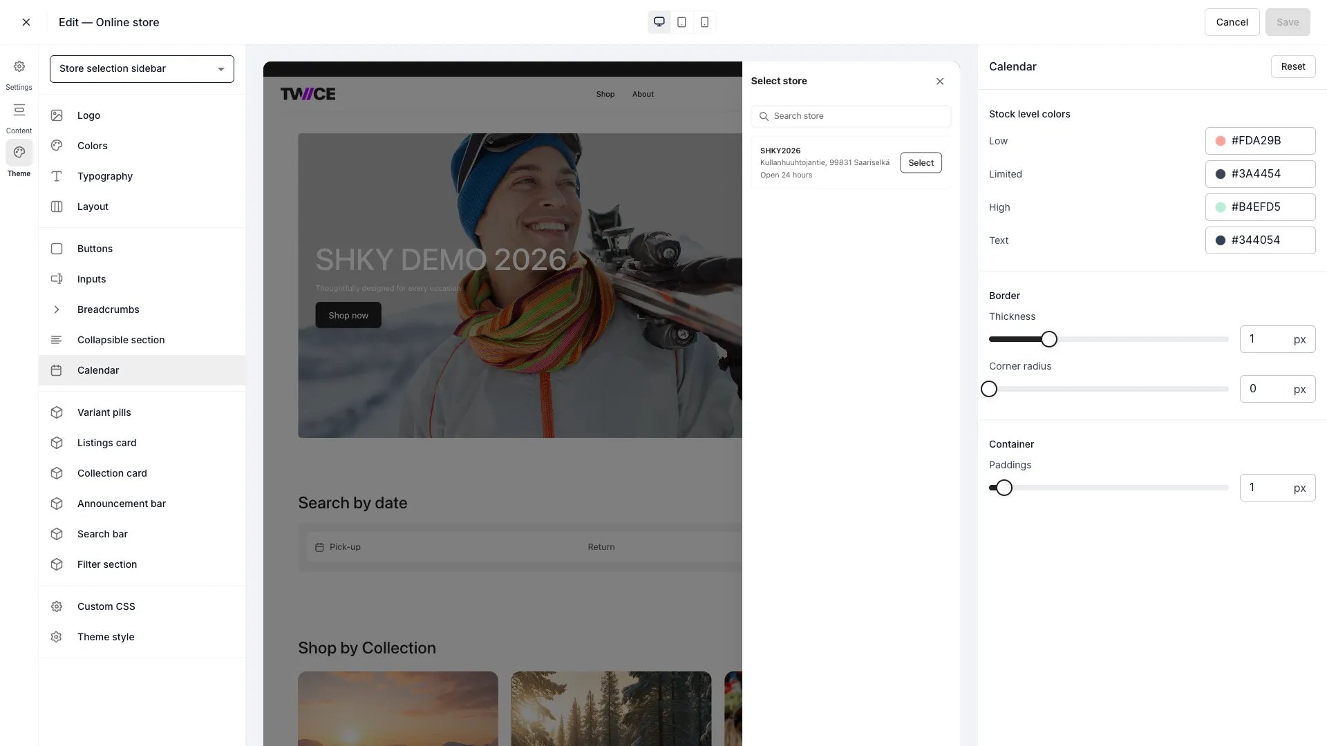 The Calendar panel customises the availability calendar widget that appears on listing pages for rental date selection. Stock level colours indicate how much inventory is available on each date, and configurable thresholds control when each colour band applies.
Stock level indicators on the calendar are only visible when the **Show stock level** option is enabled in the storefront content settings for the listing page. When disabled, date cells render without colour coding and the stock level legend is hidden.
## Stock level colours
Each stock level has a separate background and text colour. Four levels are available:
| Setting | Default | Description |
| ----------------------- | --------- | ------------------------------------------------------------------------ |
| Low background | `#FDA29B` | Background colour for date cells at or below the Low threshold. |
| Low text | `#344054` | Text colour inside low-stock date cells. |
| Limited background | `#F5C771` | Background colour for date cells between the Low and Limited thresholds. |
| Limited text | `#344054` | Text colour inside limited-stock date cells. |
| High background | `#B4EFD5` | Background colour for date cells above the Limited threshold. |
| High text | `#344054` | Text colour inside high-stock date cells. |
| Out of stock background | `#E4E6EB` | Background colour for date cells with no available stock. |
| Out of stock text | `#6B7280` | Text colour inside out-of-stock date cells. |
## Stock level thresholds
Thresholds control when each colour band applies. They are percentages of available stock relative to total stock at a location.
| Setting | Type | Default | Range | Description |
| ------- | ------ | ------- | ------ | --------------------------------------------------------------------------------------------------------------------------------------------- |
| Low | Number | 25% | 0–100% | Dates with availability at or below this percentage show the **Low** colour. |
| Limited | Number | 60% | 0–100% | Dates with availability between the Low threshold and this percentage show the **Limited** colour. Dates above this percentage show **High**. |
The Low threshold must be less than or equal to the Limited threshold. If you set Low above Limited, the panel adjusts Limited to match automatically.
## Selected date
Colours for the currently selected date on the calendar.
| Setting | Default | Description |
| ---------- | --------- | -------------------------------------------- |
| Background | `#212121` | Background colour of the selected date cell. |
| Text | `#FFFFFF` | Text colour of the selected date cell. |
## Day cell
| Setting | Type | Default | Range | Description |
| ------------- | ------ | ------- | ----- | ------------------------------------------------------------ |
| Corner radius | Slider | 50% | 0–50% | How rounded each day cell is. 0% is square, 50% is circular. |
## Today
| Setting | Default | Description |
| ------- | --------- | ------------------------------------ |
| Border | `#212121` | Border colour for today's date cell. |
## Border
| Setting | Type | Default | Range | Description |
| ------------- | ------ | --------- | ------- | ----------------------------------------- |
| Color | Color | `#212121` | — | Border colour around the calendar widget. |
| Thickness | Slider | 1 px | 0–4 px | Border width around the calendar widget. |
| Corner radius | Slider | 0 px | 0–40 px | How rounded the calendar corners are. |
## Container
| Setting | Type | Default | Range | Description |
| ------- | ------ | ------- | ------- | ------------------------------------------------------------- |
| Padding | Slider | 1 px | 0–16 px | Internal padding between the calendar border and its content. |
## Stock level legend
When **Show stock level** is enabled, a legend appears below the calendar showing coloured swatches with labels for each stock level (Out of stock, Low, Limited, High). The swatch shape matches the day cell corner radius for visual consistency.
You can customise the legend labels in the storefront content settings for the listing page. If a label is left empty, that legend entry is hidden.
## CSS variables
```css CSS variables theme={null}
:root {
/* Stock level colours */
--storefront-calendar-stock-low-color: #FDA29B;
--storefront-calendar-stock-low-text-color: #344054;
--storefront-calendar-stock-limited-color: #F5C771;
--storefront-calendar-stock-limited-text-color: #344054;
--storefront-calendar-stock-high-color: #B4EFD5;
--storefront-calendar-stock-high-text-color: #344054;
--storefront-calendar-stock-out-background-color: #E4E6EB;
--storefront-calendar-stock-out-text-color: #6B7280;
/* Stock level thresholds */
--storefront-calendar-stock-low-threshold: 25;
--storefront-calendar-stock-limited-threshold: 60;
/* Selected date */
--storefront-calendar-selected-background-color: #212121;
--storefront-calendar-selected-text-color: #FFFFFF;
/* Today */
--storefront-calendar-today-border-color: #212121;
/* Day cell */
--storefront-calendar-day-cell-corner-radius: 50%;
/* Border */
--storefront-calendar-border-color: #212121;
--storefront-calendar-border-width: 1px;
--storefront-calendar-border-radius: 0px;
/* Container */
--storefront-calendar-container-padding: 1px;
/* Other */
--storefront-calendar-accent-color: #212121;
--storefront-calendar-background-color: #FFFFFF;
}
```
## Related
Define the storefront colour palette.
Configure form field styles.
The Calendar panel customises the availability calendar widget that appears on listing pages for rental date selection. Stock level colours indicate how much inventory is available on each date, and configurable thresholds control when each colour band applies.
Stock level indicators on the calendar are only visible when the **Show stock level** option is enabled in the storefront content settings for the listing page. When disabled, date cells render without colour coding and the stock level legend is hidden.
## Stock level colours
Each stock level has a separate background and text colour. Four levels are available:
| Setting | Default | Description |
| ----------------------- | --------- | ------------------------------------------------------------------------ |
| Low background | `#FDA29B` | Background colour for date cells at or below the Low threshold. |
| Low text | `#344054` | Text colour inside low-stock date cells. |
| Limited background | `#F5C771` | Background colour for date cells between the Low and Limited thresholds. |
| Limited text | `#344054` | Text colour inside limited-stock date cells. |
| High background | `#B4EFD5` | Background colour for date cells above the Limited threshold. |
| High text | `#344054` | Text colour inside high-stock date cells. |
| Out of stock background | `#E4E6EB` | Background colour for date cells with no available stock. |
| Out of stock text | `#6B7280` | Text colour inside out-of-stock date cells. |
## Stock level thresholds
Thresholds control when each colour band applies. They are percentages of available stock relative to total stock at a location.
| Setting | Type | Default | Range | Description |
| ------- | ------ | ------- | ------ | --------------------------------------------------------------------------------------------------------------------------------------------- |
| Low | Number | 25% | 0–100% | Dates with availability at or below this percentage show the **Low** colour. |
| Limited | Number | 60% | 0–100% | Dates with availability between the Low threshold and this percentage show the **Limited** colour. Dates above this percentage show **High**. |
The Low threshold must be less than or equal to the Limited threshold. If you set Low above Limited, the panel adjusts Limited to match automatically.
## Selected date
Colours for the currently selected date on the calendar.
| Setting | Default | Description |
| ---------- | --------- | -------------------------------------------- |
| Background | `#212121` | Background colour of the selected date cell. |
| Text | `#FFFFFF` | Text colour of the selected date cell. |
## Day cell
| Setting | Type | Default | Range | Description |
| ------------- | ------ | ------- | ----- | ------------------------------------------------------------ |
| Corner radius | Slider | 50% | 0–50% | How rounded each day cell is. 0% is square, 50% is circular. |
## Today
| Setting | Default | Description |
| ------- | --------- | ------------------------------------ |
| Border | `#212121` | Border colour for today's date cell. |
## Border
| Setting | Type | Default | Range | Description |
| ------------- | ------ | --------- | ------- | ----------------------------------------- |
| Color | Color | `#212121` | — | Border colour around the calendar widget. |
| Thickness | Slider | 1 px | 0–4 px | Border width around the calendar widget. |
| Corner radius | Slider | 0 px | 0–40 px | How rounded the calendar corners are. |
## Container
| Setting | Type | Default | Range | Description |
| ------- | ------ | ------- | ------- | ------------------------------------------------------------- |
| Padding | Slider | 1 px | 0–16 px | Internal padding between the calendar border and its content. |
## Stock level legend
When **Show stock level** is enabled, a legend appears below the calendar showing coloured swatches with labels for each stock level (Out of stock, Low, Limited, High). The swatch shape matches the day cell corner radius for visual consistency.
You can customise the legend labels in the storefront content settings for the listing page. If a label is left empty, that legend entry is hidden.
## CSS variables
```css CSS variables theme={null}
:root {
/* Stock level colours */
--storefront-calendar-stock-low-color: #FDA29B;
--storefront-calendar-stock-low-text-color: #344054;
--storefront-calendar-stock-limited-color: #F5C771;
--storefront-calendar-stock-limited-text-color: #344054;
--storefront-calendar-stock-high-color: #B4EFD5;
--storefront-calendar-stock-high-text-color: #344054;
--storefront-calendar-stock-out-background-color: #E4E6EB;
--storefront-calendar-stock-out-text-color: #6B7280;
/* Stock level thresholds */
--storefront-calendar-stock-low-threshold: 25;
--storefront-calendar-stock-limited-threshold: 60;
/* Selected date */
--storefront-calendar-selected-background-color: #212121;
--storefront-calendar-selected-text-color: #FFFFFF;
/* Today */
--storefront-calendar-today-border-color: #212121;
/* Day cell */
--storefront-calendar-day-cell-corner-radius: 50%;
/* Border */
--storefront-calendar-border-color: #212121;
--storefront-calendar-border-width: 1px;
--storefront-calendar-border-radius: 0px;
/* Container */
--storefront-calendar-container-padding: 1px;
/* Other */
--storefront-calendar-accent-color: #212121;
--storefront-calendar-background-color: #FFFFFF;
}
```
## Related
Define the storefront colour palette.
Configure form field styles.