> ## Documentation Index
> Fetch the complete documentation index at: https://www.twicecommerce.com/docs/llms.txt
> Use this file to discover all available pages before exploring further.
# Theme Editor - Buttons
> Configure button colours, border thickness, and corner radius for primary and secondary CTAs across the storefront.
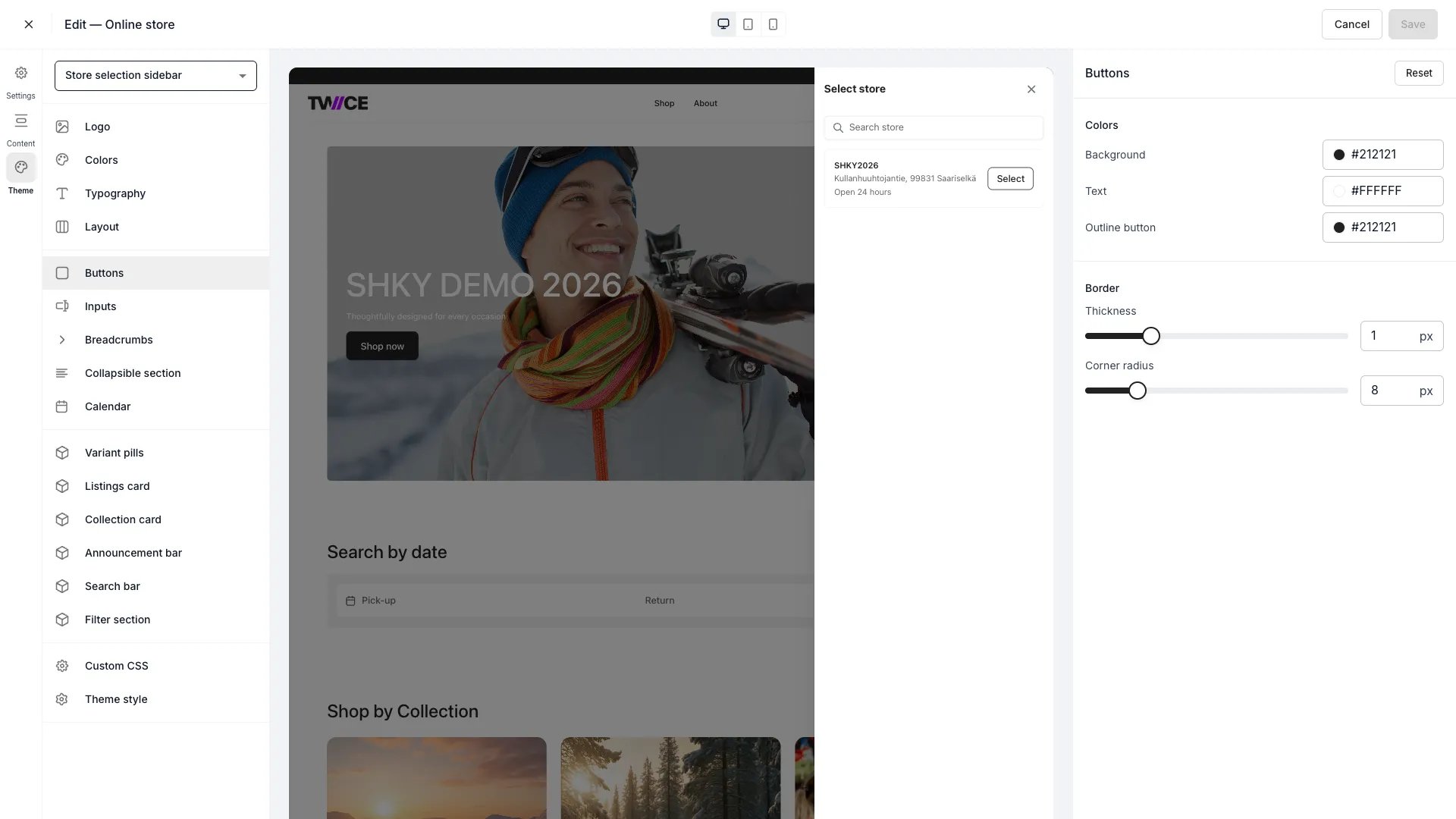 The Buttons panel controls the appearance of primary (filled) and secondary (outline) call-to-action buttons across the storefront — add-to-cart, checkout, and navigation buttons all inherit these styles.
## Colors
| Setting | Default | Description |
| -------------- | --------- | ------------------------------------------------------- |
| Background | `#212121` | Fill colour for primary buttons. |
| Text | `#FFFFFF` | Text colour inside primary buttons. |
| Outline button | `#212121` | Border and text colour for secondary (outline) buttons. |
## Border
| Setting | Type | Default | Range | Description |
| ------------- | ------ | ------- | ------- | ----------------------------------------------------------------------------------------------------- |
| Thickness | Slider | 1 px | 0–4 px | Border width on all buttons. Set to 0 to remove the border. |
| Corner radius | Slider | 6 px | 0–40 px | How rounded the button corners are. 0 gives sharp corners; higher values produce pill-shaped buttons. |
## CSS variables
```css CSS variables theme={null}
:root {
--storefront-button-background-color: #212121;
--storefront-button-text-color: #FFFFFF;
--storefront-button-outline-color: #212121;
--storefront-button-border-width: 1px;
--storefront-button-border-radius: 6px;
}
```
## Related
Configure form field styles.
Define the storefront colour palette.
The Buttons panel controls the appearance of primary (filled) and secondary (outline) call-to-action buttons across the storefront — add-to-cart, checkout, and navigation buttons all inherit these styles.
## Colors
| Setting | Default | Description |
| -------------- | --------- | ------------------------------------------------------- |
| Background | `#212121` | Fill colour for primary buttons. |
| Text | `#FFFFFF` | Text colour inside primary buttons. |
| Outline button | `#212121` | Border and text colour for secondary (outline) buttons. |
## Border
| Setting | Type | Default | Range | Description |
| ------------- | ------ | ------- | ------- | ----------------------------------------------------------------------------------------------------- |
| Thickness | Slider | 1 px | 0–4 px | Border width on all buttons. Set to 0 to remove the border. |
| Corner radius | Slider | 6 px | 0–40 px | How rounded the button corners are. 0 gives sharp corners; higher values produce pill-shaped buttons. |
## CSS variables
```css CSS variables theme={null}
:root {
--storefront-button-background-color: #212121;
--storefront-button-text-color: #FFFFFF;
--storefront-button-outline-color: #212121;
--storefront-button-border-width: 1px;
--storefront-button-border-radius: 6px;
}
```
## Related
Configure form field styles.
Define the storefront colour palette.