> ## Documentation Index
> Fetch the complete documentation index at: https://www.twicecommerce.com/docs/llms.txt
> Use this file to discover all available pages before exploring further.
# Theme Editor - Listing page
> Configure the product page — breadcrumbs, product details, booking widget, and recommended listings.
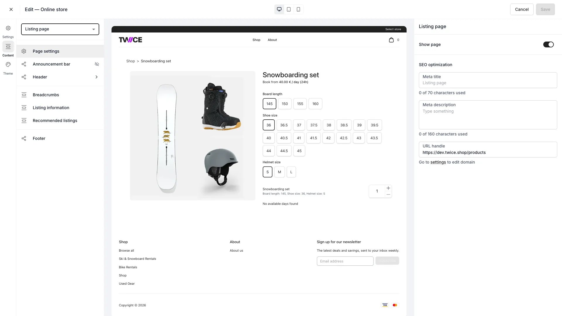 The Listing page is the product detail page a customer sees for a single [listing](/docs/concepts/catalog/listings).
## Sections
| Section | What it does |
| ------------------------ | ------------------------------------------------------------------------------------------------------------------------------------------------------------------------------------------------------------------------------------------------------------------ |
| **Breadcrumbs** | Toggle the breadcrumb trail at the top of the page. |
| **Listing information** | The core product area — images, title, price, variant options, and add to cart. |
| **Pickup availability** | The card showing where the listing can be picked up. Toggle the card, **Show item counts**, and **Show other locations**. Its colours are styled in the [Pickup availability](/docs/sales-channels/online-store/theme-editor/settings/pickup-availability) theme panel. |
| **Recommended listings** | Show upselling or related listings. These come from the listing's [Recommendations](/docs/catalog/listings/recommendations) and [Add-ons](/docs/catalog/listings/addons). |
For rentals, the availability calendar shown here is styled in the [Calendar](/docs/sales-channels/online-store/theme-editor/settings/calendar) settings; variant option pills in [Variant pills](/docs/sales-channels/online-store/theme-editor/settings/variant-pills).
## Booking widget
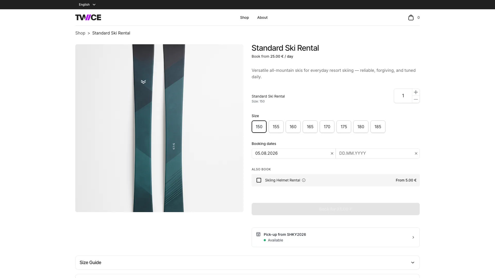
The booking widget is the main interactive element on the listing page. It handles variant selection, date and time picking, quantity, add-ons, and add-to-cart for all purchase types.
The Listing page is the product detail page a customer sees for a single [listing](/docs/concepts/catalog/listings).
## Sections
| Section | What it does |
| ------------------------ | ------------------------------------------------------------------------------------------------------------------------------------------------------------------------------------------------------------------------------------------------------------------ |
| **Breadcrumbs** | Toggle the breadcrumb trail at the top of the page. |
| **Listing information** | The core product area — images, title, price, variant options, and add to cart. |
| **Pickup availability** | The card showing where the listing can be picked up. Toggle the card, **Show item counts**, and **Show other locations**. Its colours are styled in the [Pickup availability](/docs/sales-channels/online-store/theme-editor/settings/pickup-availability) theme panel. |
| **Recommended listings** | Show upselling or related listings. These come from the listing's [Recommendations](/docs/catalog/listings/recommendations) and [Add-ons](/docs/catalog/listings/addons). |
For rentals, the availability calendar shown here is styled in the [Calendar](/docs/sales-channels/online-store/theme-editor/settings/calendar) settings; variant option pills in [Variant pills](/docs/sales-channels/online-store/theme-editor/settings/variant-pills).
## Booking widget
The booking widget is the main interactive element on the listing page. It handles variant selection, date and time picking, quantity, add-ons, and add-to-cart for all purchase types.
 ### Purchase options
The widget presents the purchase options available for the listing:
* **Book** — rental bookings with date/time selection and an availability calendar
* **Buy** — one-time sales with no date selection
* **Subscribe** — recurring subscription plans
Each option appears as a call-to-action button. When a listing supports multiple purchase types, the customer picks one to expand the corresponding flow.
### Desktop and mobile layouts
On **desktop**, the booking widget renders inline in the right column of a two-column layout (images left, details and widget right). The widget sticks to the viewport as the customer scrolls. Tapping a purchase option expands the booking or purchase flow inline.
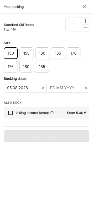
On **mobile**, the listing page shows a fixed bottom bar with call-to-action buttons. Tapping any button opens a full-screen drawer containing the complete booking flow — variant selection, date/time pickers, quantity, add-ons, and the add-to-cart button.
### Purchase options
The widget presents the purchase options available for the listing:
* **Book** — rental bookings with date/time selection and an availability calendar
* **Buy** — one-time sales with no date selection
* **Subscribe** — recurring subscription plans
Each option appears as a call-to-action button. When a listing supports multiple purchase types, the customer picks one to expand the corresponding flow.
### Desktop and mobile layouts
On **desktop**, the booking widget renders inline in the right column of a two-column layout (images left, details and widget right). The widget sticks to the viewport as the customer scrolls. Tapping a purchase option expands the booking or purchase flow inline.
On **mobile**, the listing page shows a fixed bottom bar with call-to-action buttons. Tapping any button opens a full-screen drawer containing the complete booking flow — variant selection, date/time pickers, quantity, add-ons, and the add-to-cart button.
 ### Variant selection
[Variant](/docs/concepts/catalog/variants) selection happens inside the booking widget, not as a standalone element on the listing page. Each variant axis (such as Size or Colour) displays as a row of pill-shaped buttons. The customer taps a pill to select a value.
When a variant axis has only one value, it is automatically selected — the customer does not need to interact with it. When multiple values exist, the first value is pre-selected and the customer can change it by tapping a different pill.
Selecting a different variant value updates the availability calendar and pricing in real time. Add-ons only appear after all variant axes have a selection.
### Date and time selection
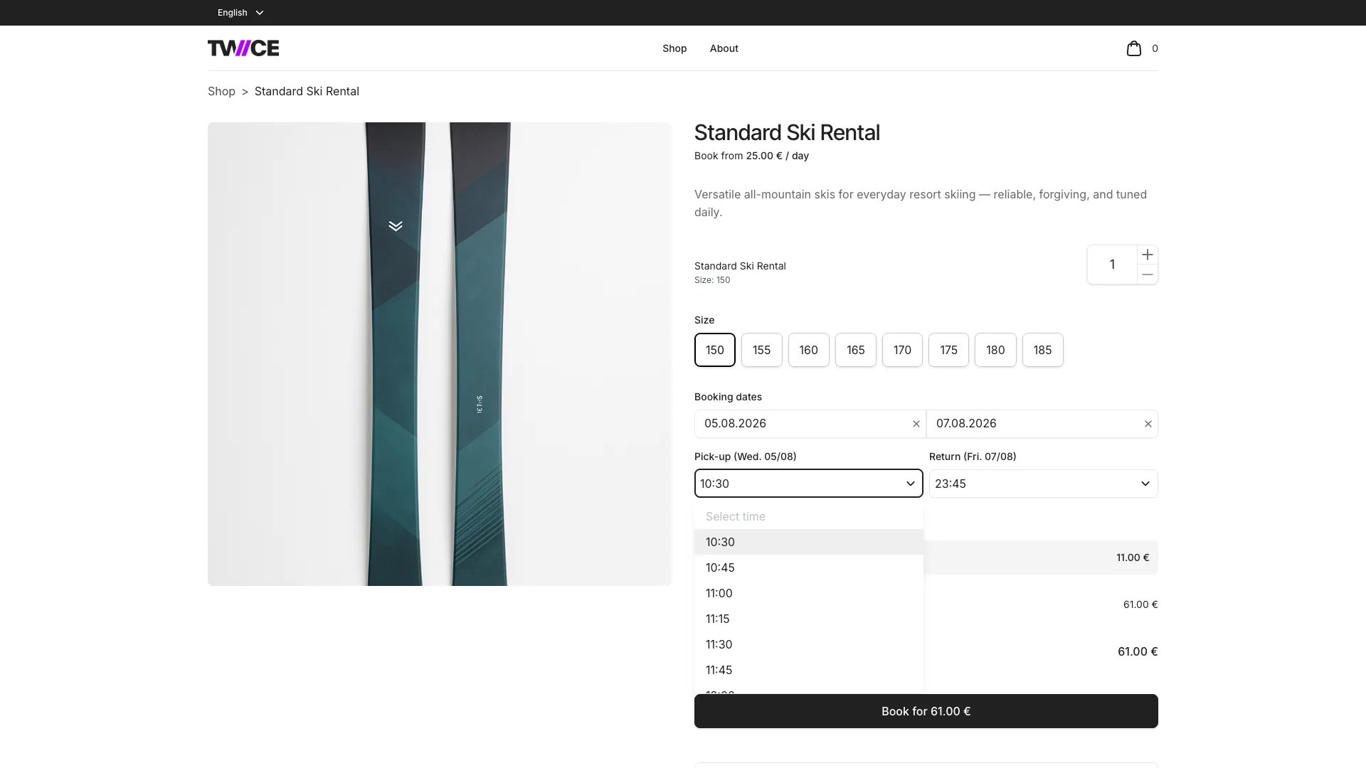
For booking purchases, the widget shows:
1. **Duration options** — fixed-length packages or a custom date range, depending on how the listing's [price table](/docs/concepts/catalog/price-tables) is configured
2. **Date picker** — an availability calendar highlighting open and blocked dates. The first available date is pre-selected.
3. **Time pickers** — pickup and return time dropdowns that appear after dates are selected. Unavailable time slots are hidden from the picker to keep the options clean. If a previously selected time becomes unavailable, it remains visible so the customer can see their selection needs to change.
### Variant selection
[Variant](/docs/concepts/catalog/variants) selection happens inside the booking widget, not as a standalone element on the listing page. Each variant axis (such as Size or Colour) displays as a row of pill-shaped buttons. The customer taps a pill to select a value.
When a variant axis has only one value, it is automatically selected — the customer does not need to interact with it. When multiple values exist, the first value is pre-selected and the customer can change it by tapping a different pill.
Selecting a different variant value updates the availability calendar and pricing in real time. Add-ons only appear after all variant axes have a selection.
### Date and time selection
For booking purchases, the widget shows:
1. **Duration options** — fixed-length packages or a custom date range, depending on how the listing's [price table](/docs/concepts/catalog/price-tables) is configured
2. **Date picker** — an availability calendar highlighting open and blocked dates. The first available date is pre-selected.
3. **Time pickers** — pickup and return time dropdowns that appear after dates are selected. Unavailable time slots are hidden from the picker to keep the options clean. If a previously selected time becomes unavailable, it remains visible so the customer can see their selection needs to change.
 ### Add to cart
When the customer confirms their selection, the widget validates that all required fields are complete (variants, dates, times, quantity) and sends the selection to the server for a final availability check. On success, the item is added to the [cart](/docs/sales-channels/online-store/theme-editor/pages/bag).
## Shared blocks
The announcement bar, header, footer, and page settings apply across the store — see the [Theme Editor overview](/docs/sales-channels/online-store/theme-editor/overview#blocks-on-most-pages).
## Related
Style the variant option selectors.
Style the rental availability calendar.
Variant axes, values, and per-variant pricing.
Booking, sale, and subscription pricing configuration.
### Add to cart
When the customer confirms their selection, the widget validates that all required fields are complete (variants, dates, times, quantity) and sends the selection to the server for a final availability check. On success, the item is added to the [cart](/docs/sales-channels/online-store/theme-editor/pages/bag).
## Shared blocks
The announcement bar, header, footer, and page settings apply across the store — see the [Theme Editor overview](/docs/sales-channels/online-store/theme-editor/overview#blocks-on-most-pages).
## Related
Style the variant option selectors.
Style the rental availability calendar.
Variant axes, values, and per-variant pricing.
Booking, sale, and subscription pricing configuration.